Following on from my previous post on the many ways in which website traffic data is collected, comes the issue of what to do with that information.
Website usage statistics can be retrieved using a variety of methods and similarly, it can be interpreted and analysed using several different models.
One of the reasons that analytics programmes such as open Web Analytics and Google Analytics have become so popular is that they give web developers (or digital marketers, system administrators, financial planners etc) a way to easily understand and interpret the information collected about visitors to the site.
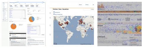
These programmes provide user friendly, visual information about the traffic to their sites, allowing data to be broken down and visualised in different ways. These often inlcude:
- A dashboard with an overview of relevant statistics
- Breakdown of users’ geographical locations on a map
- Graphs and charts of interaction over time, allowing analysts to identify trends in usage.
- “Heat maps” showing the locations on webpages that users click
Viewing Server Logs
The most readily available tool for web developers when measuring traffic to a website are the server logs. Server logs are a collection of statistics created by the web server and generally contain information about the requests made to the server including:
- IP address
- user agent string
- referring site
- request date/time
- pages requested
Unlike some analytics programmes which have come under criticism, viewing the website information via these logs requires absolutely no compromise of sensitive website or business data.
Unfortunately, although server logs contain a lot of useful data, their native format makes it difficult to visualise this information.
There are several open source tools which allow website owners to more easily interpret these logs. One such tool is Logstalgia, a “website log visualisation tool” which allows you to view activity on your server logs in a graphical format and in real time!
Both Webalizer and AW Stats are also useful in interpreting server logs, providing information based on server logs but presented in a format similar to the other analytical tools above.


Something to note also is that google analytics can miss users that have javascript blocked, whereas log files can overstate the number of users (counting bots). The best strategy is to look at both data sources.
Also, have a look at Piwik and Open Web Analytics as alternatives to google analytics.
Thanks Anntoin, that’s a good point. Not sure how it works in log files but I seem to remember coming across the option to exclude traffic from specified IP addresses from analytics reports in Google Analytics using filters. Obviously this only works for crawlers or bots with known IPs, and I think it was quite a manual process as well. Not ideal!
The information on users’ browser plugins in Piwik is neat. Having “clickmaps” in Open Web Analytics is a really good bonus feature too, especially for UI geeks.